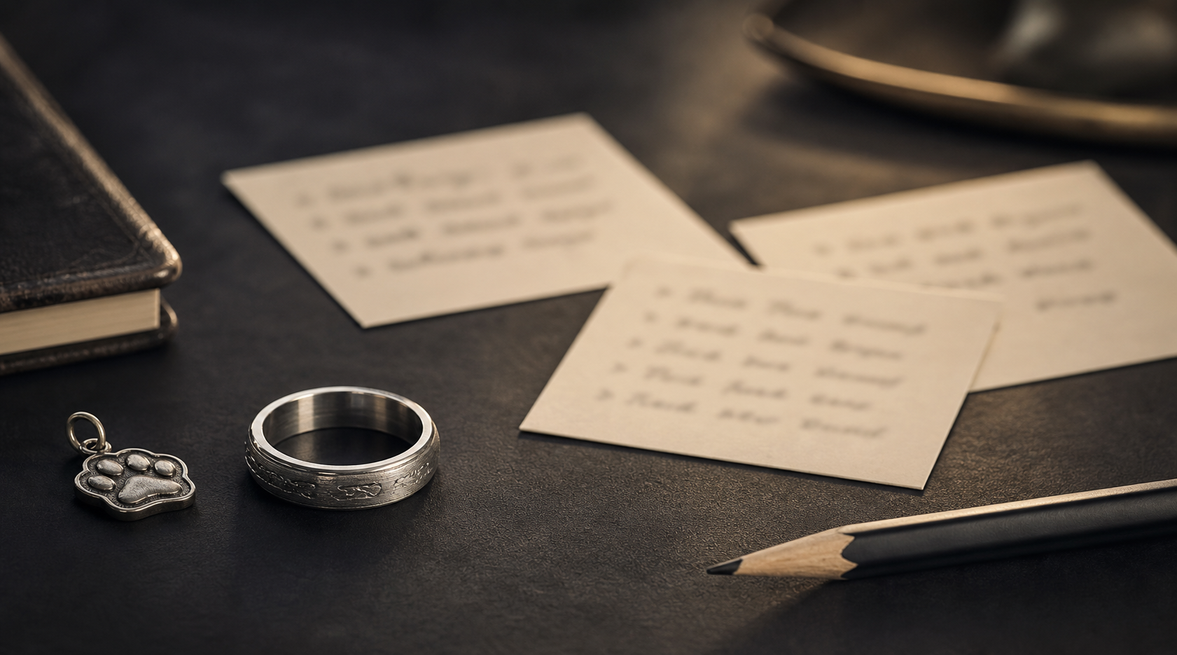
The strongest version of this ring comes from the short line, date, name, or symbol that explains the ring fastest. Build the rest of the design around it, not alongside it.
Names, initials, coordinates, vow fragments, family phrases, one-word promises, faith marks, service symbols, pet nicknames, or years together can each work well on their own. Trouble starts when two or three of them compete for the same space on the band.
private words belong inside, while visible identity marks should stay simple enough to read outside. Getting this right early avoids redoing the layout later.
contrast and width decide whether the idea should be text, symbol, print, or inside-only message. A finish that photographs well is not always the one that reads clearly on skin.
use language from the real relationship instead of polished phrases that could belong to anyone. Write the final phrase before choosing fonts, so the words are not hiding weak wording behind style.
if the idea comes from a photo, print, card, or note, send the source and confirm the exact text. Good source material is the difference between a crisp engraving and a muddy one.
choose one engraving idea by purpose: promise, memory, identity, place, faith, or family. Keep the layout simple enough to read at a glance, not just up close.
Skip avoid combining a quote, date, symbol, photo, and print just because they are all meaningful. What looks like more detail on paper usually looks like clutter on a ring.
Decide what the ring should say when there is room for only one idea. That decision matters more than any single symbol or font choice.
When ready, bring the chosen phrase, backup short phrase, date, symbol, and story note into the Friends of Irony designer.